
The debt ceiling was always an issue in the United States. As of today, the national government debt has reached the debt ceiling, which is $31.4 trillion. The authorities have warned of chaotic consequences if Congress no longer approves the debt ceiling.
The U.S. government has managed an annual deficit of approximately $1 billion since 2001. We will examine this situation in a more extended period and scope for the United States. The variables we are going to use:
- gross domestic product per capita(gdp)
- the general government deficit as a percentage of GDP(deficit)
- the unemployment rate(unemployment)
We will compare gdp and deficit variables in an interactive bar chart.
library(tidyverse)
library(tidymodels)
library(DALEXtra)
library(ggtext)
library(glue)
library(plotly)
library(sysfonts)
library(showtext)
library(modelStudio)

df <- read_csv("https://raw.githubusercontent.com/mesdi/blog/main/deficit.csv")

#adding google font
font_add_google(name = "Roboto Slab", family = "slab")
showtext_auto()

#Hoverinfo texts
text_gdp <- glue("GDP/capita: {number(df$gdp, scale_cut = cut_short_scale(),accuracy = 1)}\nYear: {df$time}")
text_deficit <- glue("Deficit/GDP: {number(df$deficit, suffix = '%', accuracy = 0.01)}\nYear: {df$time}")

#coefficient for dual y-axis transformation
coeff <- mean(df$gdp) / mean(df$deficit) %>% abs()

#Comparing GDP per capita and deficit % of GDP for the U.S.
df %>%
  ggplot(aes(time)) +
  geom_bar(aes(y = gdp, text = text_gdp),
           stat = "identity",
           fill = "blue") +
  geom_line(aes(y = gdp, text = text_gdp, group = 1),
            color = "navyblue",
            linewidth = 2) +
  geom_bar(aes(y = deficit * coeff, text = text_deficit),
           stat= "identity",
           fill = "red")+
  geom_line(aes(y = deficit * coeff, text = text_deficit, group = 1),
            color = "#800000",
            linewidth = 2) +
  #second(dual) y-axis
  scale_y_continuous(sec.axis = sec_axis(~./coeff)) +
  xlab("")+
  ylab("")+
  ggtitle("<span style = 'color:blue'>GDP per capita</span>  vs. <span style = 'color:red;'>Deficit % of GDP </span> for the U.S.")+
  theme_minimal()+
  theme(panel.grid.minor = element_blank(),
        axis.text.y = element_blank(),
        axis.text.x = element_text(size=12),
        plot.title = ggtext::element_markdown(hjust = 0.5)) -> p

#setting font family for ggplotly
font <- list(
  family= "Roboto Slab",
  size=15
)

#setting font family for hover label
label <- list(
  font = font
)

#converts ggplot2 object to plotly for interactive chart
ggplotly(p, tooltip = "text") %>%
  style(hoverlabel = label) %>%
  layout(font = font)
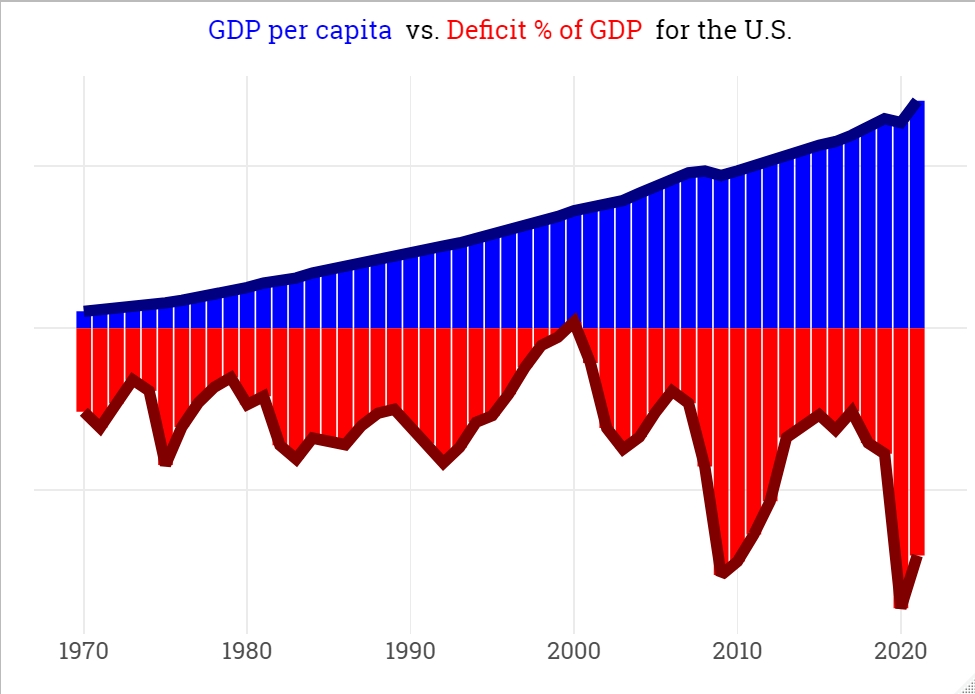
When we analyze the above chart, we can say that the years 2010 and 2020 have the highest deficit rate values; unemployment rates during the mortgage crisis and the pandemic, respectively, might be one of the causes of that situation.
Now, we will examine what causes might affect the deficit rates; in order to do that, we will model the data with the xgboost and find the feature importance scores and the Shapley values with the modelStudio package.
#Preprocessing
df_rec <-
  recipe(deficit ~ gdp + unemployment, data = df)

#Creating a preprocessed data frame
df_proc <-
  df_rec %>%
  prep() %>%
  bake(new_data = NULL)

#Modeling and fitting
set.seed(12345)
df_fit <-
  boost_tree() %>%
  set_mode("regression") %>%
  set_engine("xgboost") %>%
  fit(deficit ~ ., data = df_proc)

#Explainer object
explainer <-
  DALEX::explain(
    model = df_fit,
    data  = df_proc %>% select(-deficit),
    y     = df$deficit,
    label = "XGBoost"
  )

#Model Studio
set.seed(1983)
modelStudio::modelStudio(explainer)
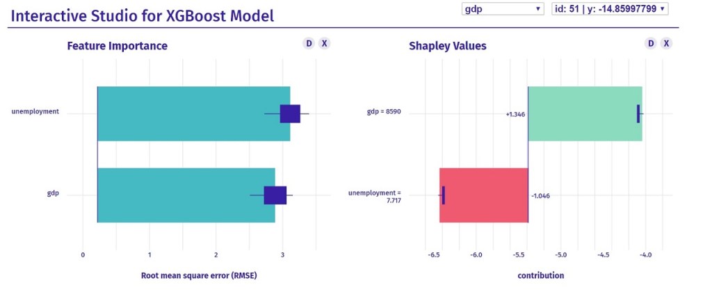
As seen above, both predictors have a close level of decisiveness on the target variable in general(feature importance); but when it comes to individual effects on the target(Shapley values), we see that they differ from each other inversely.
It is seen in the specific observation on the above graph, gdp has a decreasing effect, while unemployment has an increasing effect, on the deficit which has mostly negative values.


Leave a comment