
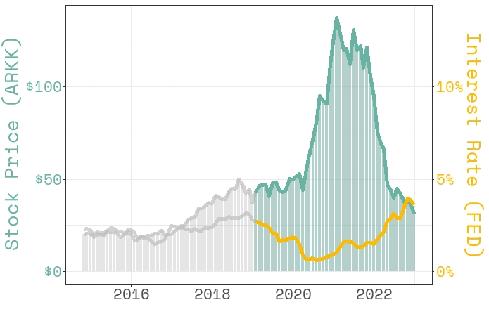
During the pandemic, the stock prices almost doubled, but their trends have recently declined. One of the reasons for that might be the interest rates. To examine this, we will take a consideration ARK Innovation ETF (ARKK), which is a long-term growth capital by investing mostly in tech companies.
First, we will create our datasets. The interest rates we are going to use are long-term interest rates that induced investment, so which is related to economic growth.
library(tidyverse)
library(tidyquant)
library(sysfonts)
library(showtext)
library(gghighlight)
library(tidymodels)
library(timetk)
library(modeltime)
library(tsibble)
library(lubridate)
library(fable)
library(ggtext)
library(scales)

#Building monthly dataset from daily prices
arkk_monthly <-
  tq_get("ARKK") %>%
  mutate(month = floor_date(date, "month"),
         close = round(close, 2)) %>%
  group_by(month) %>%
  slice_max(date) %>%
  select(date, price = close, volume)

#US long-term interest rates
interest_df <-
  read_csv("https://raw.githubusercontent.com/mesdi/blog/main/interest.csv") %>%
  #converting string to date format
  mutate(date = parse_date(date, "%Y-%m"))

#Combining the two datasets
df <-
  arkk_monthly %>%
  left_join(interest_df, by = c("month"="date")) %>%
  #converts date to the given string format
  mutate(month = format(month, "%Y %b")) %>%
  #converts string to the yearmonth object
  mutate(month = yearmonth(month)) %>%
  ungroup() %>%
  select(-country) %>%
  na.omit()
Now, we will take a look at how the stock prices of ARKK and long-term interest rates have gone along together.
#Comparing stock prices and interest rates

#adding google font
font_add_google(name = "Space Mono", family = "Mono")
showtext_auto()

df %>%
  ggplot(aes(date))+

  geom_bar(aes(y=price),
           stat = "identity",
           fill = "#69b3a2",
           color= NA,
           alpha = .4)+

  geom_line(aes(y = price),
            color= "#69b3a2",
            size =2)+

  geom_line(aes(y = interest*10), size =2, color = "#fcba03") +

  #highlights the area after 2019
  gghighlight(year(date) >= 2019)+

  scale_y_continuous(
    #Main axis
    labels = scales::label_dollar(),
    name = "Stock Price (ARKK)",

    #Add a second axis
    sec.axis = sec_axis(~./10,
                        labels = scales::label_number(suffix = "%"),
                        name="Interest Rate (FED)")
  ) +

  xlab("")+

  theme_bw(base_family = "Mono") +

  theme(
    text = element_text(size = 20),
    axis.title.y = element_text(color = "#69b3a2"),
    axis.title.y.right = element_text(color = "#fcba03"),
    axis.text.y = element_text(color = "#69b3a2"),
    axis.text.y.right = element_text(color = "#fcba03")
  )

When we look at it, especially from 2019, we can clearly see the reverse relation between stock prices and interest rates.
Based on the above inference, we will model stock prices with interest rates. To do that, we will use boosted ARIMA regression model.
#Building train and test set
df_split <- time_series_split(data = df,
                              assess = "2 years",
                              cumulative = TRUE)


df_train <- training(df_split)
df_test <- testing(df_split)

#Modeling

#Preprocessing
df_rec <-
  recipe(price ~ interest + date, df_train) %>%
  step_fourier(date, period = 12, K = 6)


#Model specification
df_spec <-
  arima_boost(
    # XGBoost Args
    tree_depth = 6,
    learn_rate = 0.1) %>%
  set_engine(engine = "auto_arima_xgboost")

#Worlflow and fitting
workflow_df <-
  workflow() %>%
  add_recipe(df_rec) %>%
  add_model(df_spec)

set.seed(12345)
workflow_df_fit <-
  workflow_df %>%
  fit(data = df_train)

#Model and calibration table
model_table <- modeltime_table(workflow_df_fit)

df_calibration <-
  model_table %>%
  modeltime_calibrate(df_test)

#Accuracy
df_calibration %>%
  modeltime_accuracy() %>%
  select(rsq)

# A tibble: 1 x 1
#    rsq
#  <dbl>
#1 0.913
The high accuracy rate encourages us to proceed with that model. Now, we will forecast stock prices for the next 12 months. But first, we must build a dataset consisting of future values of predictors. We will use the automated stepwise ARIMA model for the interest rate variable.
#Future dataset for the next 12 months
date <-
  df %>%
  as_tsibble(index= month) %>%
  new_data(12) %>%
  mutate(month = as.Date(month),
         date = ceiling_date(month, "month")-1) %>%
  as_tibble() %>%
  select(date)

interest <-
  df %>%
  as_tsibble(index = month) %>%
  model(ARIMA(interest)) %>%
  forecast(h = 12) %>%
  as_tibble() %>%
  select(interest = .mean)

df_future <-
  date %>%
  bind_cols(interest)
Finally, we refit the model on the whole dataset and draw the forecasting plot.
#Forecasting the next 12 months
df_calibration %>%
  modeltime_refit(df) %>%
  modeltime_forecast(new_data = df_future,
                     actual_data = df) %>%
  plot_modeltime_forecast(.interactive = FALSE,
                          .legend_show = FALSE,
                          .conf_interval_show = FALSE,
                          .line_size = 1,
                          .title = "Forecast Plot of ARK Innovation ETF Prices for the <span style = 'color:red;'>next 12 months</span>")+
  scale_y_continuous(labels = scales::label_dollar())+
  theme(text = element_text(size = 20, family = "Mono"),
        plot.title = ggtext::element_markdown(hjust = 0.5))
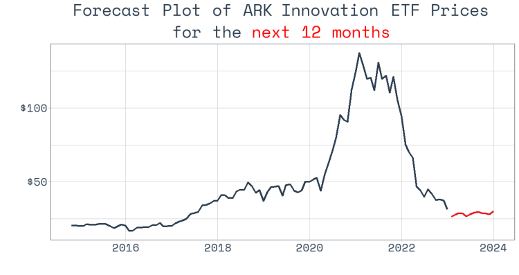
It looks like the prices will remain far below $50 in the coming year.


Leave a comment