
There has been a massive debate about the refugee crisis in Turkey for a long time. Turkish people blame immigrants (mostly from Syria) for the worsening economy, and they believe that the immigrants are in wealthy conditions while they themselves suffer from bad economic conditions.
I want to check the accuracy of these claims. First, we will compare foreign-born populations in Turkey with other immigrant intense countries; France, Germany, Greece, and the United Kingdom.
In order to do that, we have to download the migration dataset from Our World in Data. We will make waffle plots according to the proportions of the countries to each other.
library(tidyverse)
library(readxl)
library(waffle)
library(sysfonts)
library(showtext)
library(tidymodels)
library(tidyquant)

df_migration <-
  read_excel("migration.xlsx") %>%
  na.omit()

#loading Google fonts
font_add_google("Roboto Slab")
#To support and make Google fonts work
showtext_auto()

#Proportions of foreign-born populations in the given countries
df_migration %>%
  mutate(country = fct_reorder(country, migrants_rate)) %>%
  group_by(year) %>%
  ggplot(aes(fill = country, values = migrants_rate)) +
  geom_waffle(color = "white",
              size = 0.5,
              n_rows = 3,
              flip = TRUE,
              make_proportional = TRUE) +
  facet_wrap(~year, nrow = 1, strip.position = "bottom") +
  scale_x_discrete(breaks = scales::pretty_breaks()) +
  labs(title = "Proportions of foreign-born populations in the given countries",
       caption = "Source: United Nations Department of Economic and Social Affairs (UN DESA)") +
  theme_minimal(base_family = "Roboto Slab")  +
  theme(
    axis.text.y = element_blank(),
    panel.grid = element_blank(),
    legend.title = element_blank(),
    text = element_text(size=15),
    plot.title = element_text(hjust = 0.5,
                              size = 14,
                              face = "bold"),
    plot.caption = element_text(size = 10,
                                color = "blue",
                                face = "bold"),
    plot.caption.position = "plot"
  )

Although there seems to be a significant increase in Turkey after the Syrian Civil War (2011), the rate still seems quite low compared to other countries, especially Germany.
Now, let’s come to the other claim that The Turkish people said: The immigrants take our job out of our hands! The dataset for this task is foreign-born employment taken from OECD.
#Comparing employment rates of the given countries
df_employment <- read_excel("foreign_born_employment.xlsx")


df_employment %>%
  mutate(country = fct_reorder(country, employment_rate)) %>%
  ggplot(aes(year, employment_rate, fill = country)) +
  geom_bar(stat="identity", position="dodge") +
  scale_y_continuous(breaks = c(seq(0, 75, 25)))+
  labs(
    caption = "Source: OECD",
    title="Foreign-born employment aged 15-64\nin total foreign-born population of that same age ") +
  theme_minimal(base_family = "Roboto Slab") +
  theme(
    axis.ticks.y  = element_line(),
    axis.title = element_blank(),
    panel.grid = element_blank(),
    legend.title = element_blank(),
    text = element_text(size=15),
    plot.title = element_text(hjust = 0.5,
                              size = 14,
                              face = "bold"),
    plot.caption = element_text(size = 12,
                                color = "blue",
                                face = "bold"),
    plot.caption.position = "plot"
  )
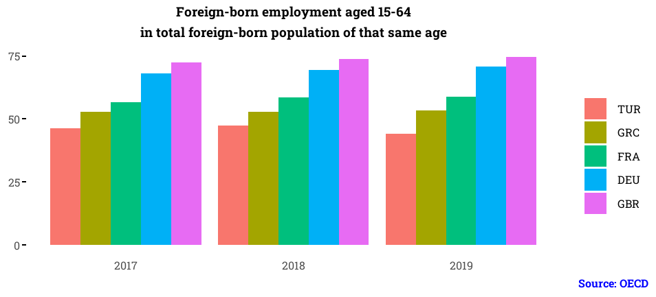
It seems that among the immigrant population less than half have had a job in Turkey, which is a low rate compared to the other countries.
The last thing we are going to do is to try to find a relationship between the conflicts (especially the Syrian Civil War) and the flow of immigrants to the countries we examined above.
For this task, we will add the conflict data to the migration data via the VLOOKUP function. We will model the number of migrants with the interaction term for total conflict-related deaths in Middle East and the relevant countries. Our goal is to find whether there is a significant relationship between the number of immigrants and the total conflict deaths in the relevant country.
df_conflict <- read_excel("conflict_toll.xlsx")


df_conflict <-
  df_migration %>%
  #Using the VLOOKUP function of excel to match the relevant time values
  #with the help of tidyquant package
  mutate(deaths = VLOOKUP(df_migration$year, df_conflict, year, deaths)) %>%
  #the cumulative sum of deaths corresponds to the cumulative sum of the number
  #of immigrants for the interested years
  mutate(deaths = cumsum(deaths))


#Simple linear regression model with interaction terms
model_lm <-
  linear_reg() %>%
  set_engine("lm")


model_fit <-
  model_lm %>%
  fit(migrants_rate ~ country:deaths, data = df_conflict)


#Comparing the countries to their p-values for the cause-effect
model_fit %>%
  tidy() %>%
  #simplifying the term names
  mutate(term= case_when(
    str_detect(term, "France") ~ "France",
    str_detect(term, "Germany") ~ "Germany",
    str_detect(term, "Greece") ~ "Greece",
    str_detect(term, "Turkey") ~ "Turkey",
    str_detect(term, "United Kingdom") ~ "United Kingdom"
  )) %>%
  .[-1,] %>% #removing the intercept
  ggplot(aes(term, p.value)) +
  geom_point(aes(color = term) , size = 3) +
  geom_hline(yintercept = 0.05,
             linetype = "dashed",
             alpha = 0.5,
             size = 1,
             color = "red") +
  labs(title ="Comparing the countries to their p-values\nat a significance level of 0.05 (red dashed line)" ,
       color = "",
       x = "",
       y = "") +
  theme_minimal(base_family = "Roboto Slab") +
  theme(
    panel.grid = element_blank(),
    axis.text = element_blank(),
    panel.background = element_rect(fill = "lightgrey", color = NA),
    text = element_text(size = 15),
    plot.title = element_text(
      hjust = 0.5,
      face = "bold",
      size = 14
    )
  )
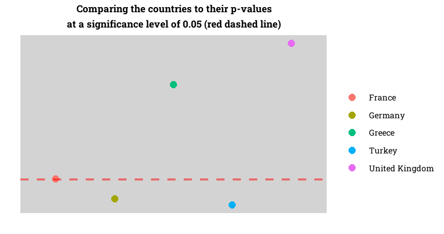
The red dashed line is the p-value of 0.05, which means, under that value, there is a statistically significant relationship between conflict in the Middle East and the immigrants in the relevant countries. To the above plot, it seems that Turkey, Germany, and partially France have that cause-effect.


Leave a comment