One of the most frequently asked questions these days is whether the vaccine works in reducing the number of cases and deaths. In order to examine that we will build a function so that we can run for every country we want without repeating the same code block.
The dataset we’re going to use for this article is from Our World in Data. What we want to do here is that we will determine the partial and total vaccination rates as a percentage relative to the relevant population. And we will examine the relationship between the number of cases and deaths given in certain monthly periods and the vaccination rates.
library(readxl)
library(dplyr)
library(lubridate)
library(rlang)
library(scales)
library(tidyr)
library(stringr)
library(purrr)
library(plotly)


df_raw <- read_excel("covid19_vacc.xlsx")


cement <- function(...){
  args <- ensyms(...)
  paste(purrr::map(args,as_string))

}
The function we’ve built called cement is taken from Advanced R book. The purpose of the function is that saves us from writing our arguments in string form, which sometimes can be quite annoying; with this function, we can write our arguments without in quotes.
fun <- function(...){

#Assigning the symbols as strings
var_loc <- cement(...)[1]
var_toll <- cement(...)[2]


  df <- df_raw %>%
    .[.$location==var_loc,] %>%
    transmute(
      date=date %>% as.Date(),
      #First phase vaccinated people
      partly=people_vaccinated-people_fully_vaccinated,
      #Fully vaccinated people
      fully=people_fully_vaccinated,
      total_vaccinations,
      new_cases,
      new_deaths,
      population

    ) %>% na.omit() %>%
    group_by(month = format(date, "%Y%m")) %>%
    mutate(
      #The monthly amount
      new_cases=cumsum(new_cases),
      new_deaths=cumsum(new_deaths),
    ) %>%
    #The last observation for each month
    slice(which.max(cumsum(partly & fully))) %>%
    ungroup() %>%
    select(-month) %>%
    #For percentage demonstration
    mutate(partly_rate=round(partly/population,4)*100,
           fully_rate=round(fully/population,4)*100)


  fig <- plot_ly(df)


  fig %>%
    add_trace(x = ~date, y = ~partly_rate, type = 'bar',
              name = 'partly',
              marker = list(color = 'ligthblue'),
              hoverinfo = "text",
              text = ~paste(partly_rate, '%')) %>%
    add_trace(x = ~date, y = ~fully_rate, type = 'bar',
              name = 'fully',
              marker = list(color = 'orange'),
              hoverinfo = "text",
              text = ~paste(fully_rate, '%')) %>%
    add_trace(x=~date, y=~.data[[var_toll]], type='scatter',mode='lines',
              name=str_replace(var_toll,"_"," "),
              yaxis="y2",
              line = list(color = 'red',width=4),
              hoverinfo="text",
              #.data is the pronoun provided by data masks:https://adv-r.hadley.nz/evaluation.html#pronouns
              text=~paste(comma(.data[[var_toll]]))) %>%
    layout(barmode = "stack",
           legend=list(orientation='h', #horizontal
                       xanchor="center", #center of x axis
                       x=0.5),
           xaxis=list(title=""),
           yaxis=list(side='left',
                      ticksuffix="%",
                      title='Total Percentage of Vaccinations'),
           yaxis2=list(overlaying="y",
                       side='right',
                       automargin=TRUE, #prevents axis title from overlapping the labels
                       title=paste("The number of",
                                   str_replace(var_toll,"_"," "),
                                   "given monthly interval")))

}
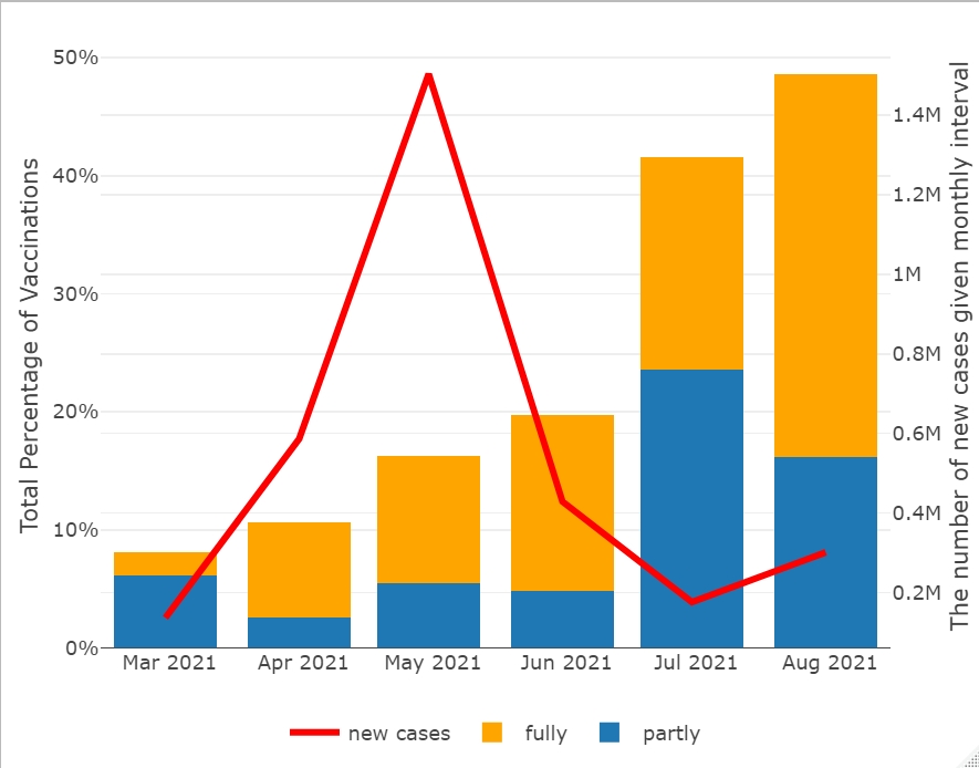
fun(Turkey,new_cases)
fun(Germany,new_cases)
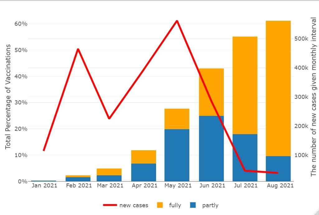
When we examine the graphs, we see that the total vaccinations are below 50% in Turkey and above 60% in Germany. Both countries peaked in the number of cases in May, but there has been a steady decline in the cases line since then as the proportion of people fully vaccinated has risen. We can clearly see that the vaccine has worked so far. So get vaccinated as soon as possible, please!


Leave a comment